portfolio Portfolio
The Ogilvy Montreal agency gets a refresh
project
Ogilvy is an agency on the move. After several acquisitions and an identity change, the group wanted to make some organizational improvements. It considered relocating but ultimately decided to optimize its existing offices, located in a neighbourhood whose character gives the agency a strategic edge. Securing an adjacent space made it possible to proceed with the project.
Innovative and classic notes in balance
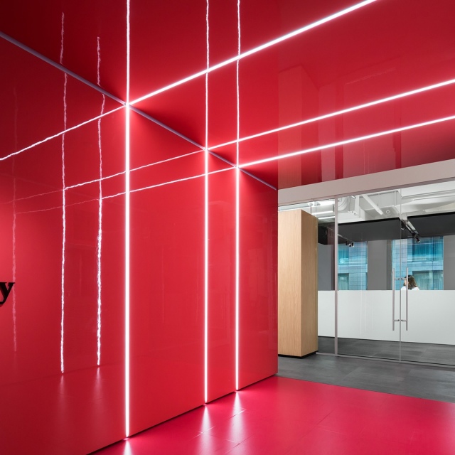
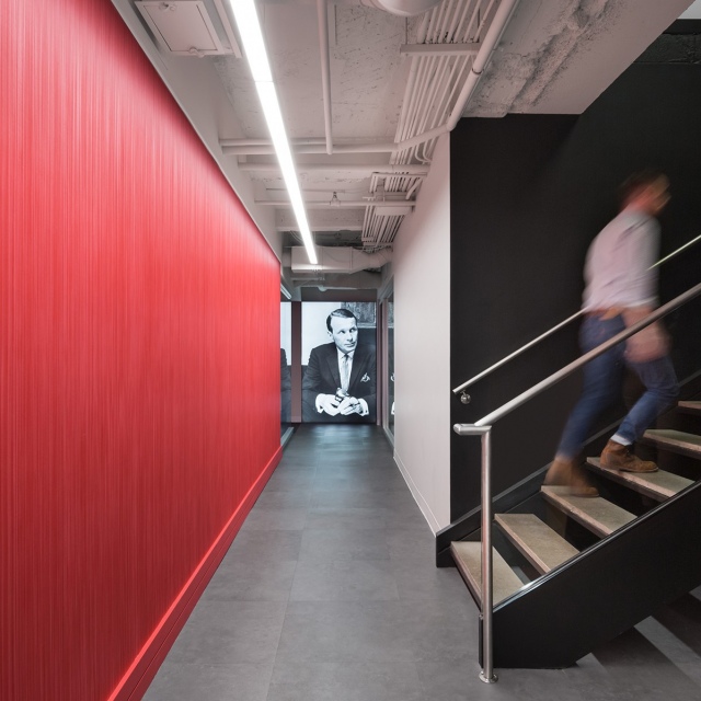
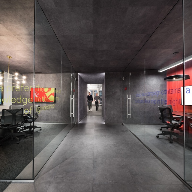
The firm has always excelled at creating original ideas. Using that fact as a starting point, the project focused on highlighting Ogilvy’s identity and history to support the company’s talented people. The concept for the new spaces was built on two distinctive elements: the leitmotif is the founder, David Ogilvy; and the red background, the brand’s signature colour. Both are integrated into a sleek, minimalist environment underscored by a simple palette of contrasting black and white.
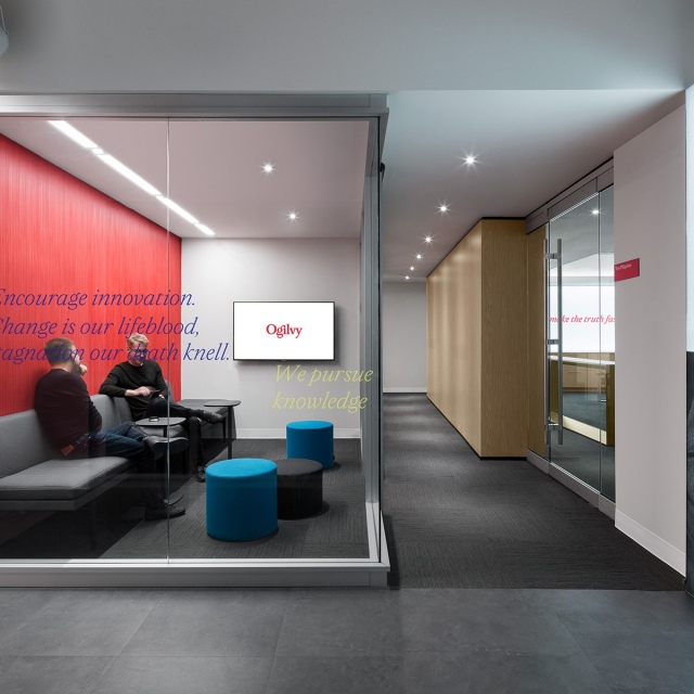
“Encourage innovation. Change is our lifeblood, stagnation our death knell.” – David Ogilvy
Creating a hybrid public and private space
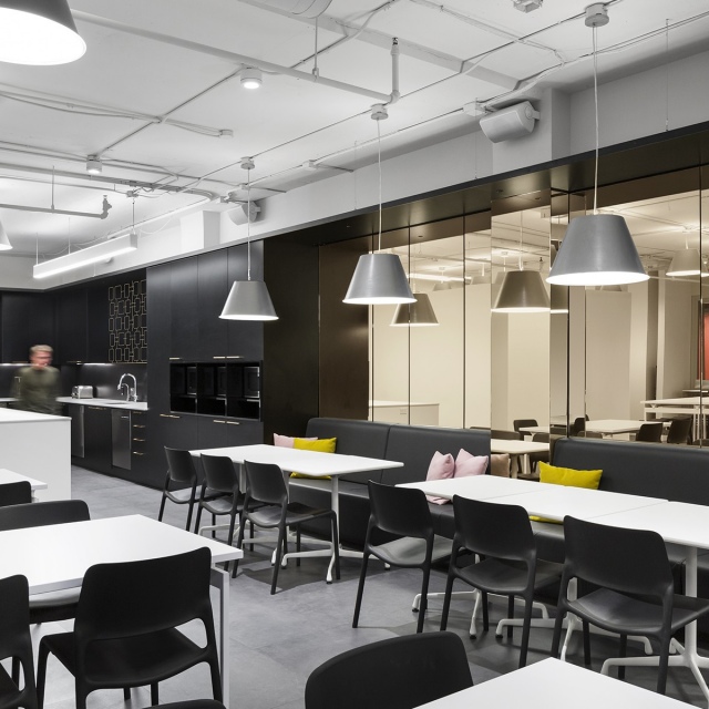
The space is a multifunctional hub, sensitive to human needs and fertile for discussions. For. design planning developed a public space for hosting and collaboration, as well as private workspaces with different levels of privacy.
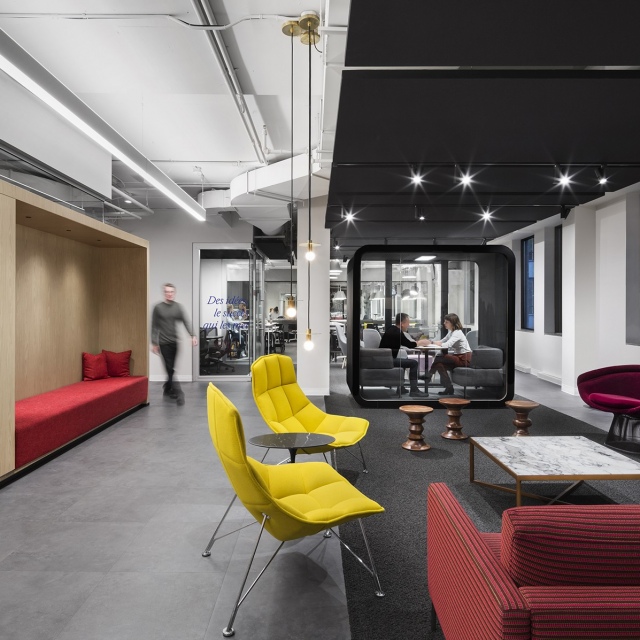
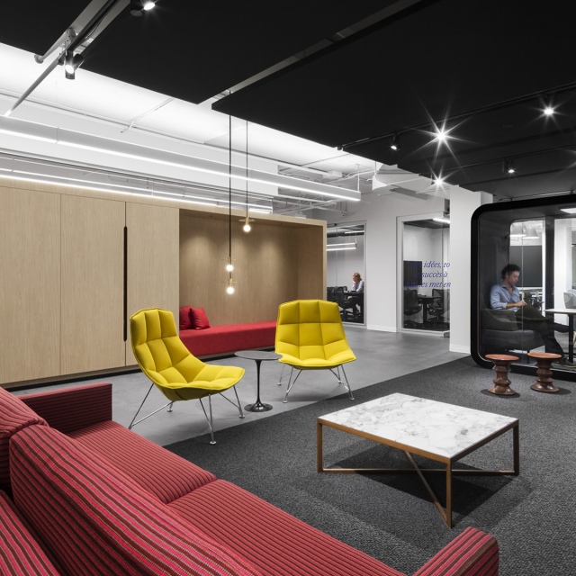
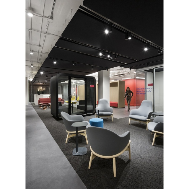
The reception desk and its boutique hotel-style quartz countertop are positioned to be more open to the outside. Visitors and clients are welcomed with a glance, a smile and a coffee. The reception area does double duty as a lounge for discussion and collaboration, both formal and informal. It is a place for creative encounters, where clients, employees from different departments and partners interact daily and where the improbable can become inevitable. Furnished with 1950s classics such as Knoll and Herman Miller, a custom-made black acoustic ceiling and accent lighting, it becomes intimate, felted, perfect for deep conversations as well as creative collaboration.
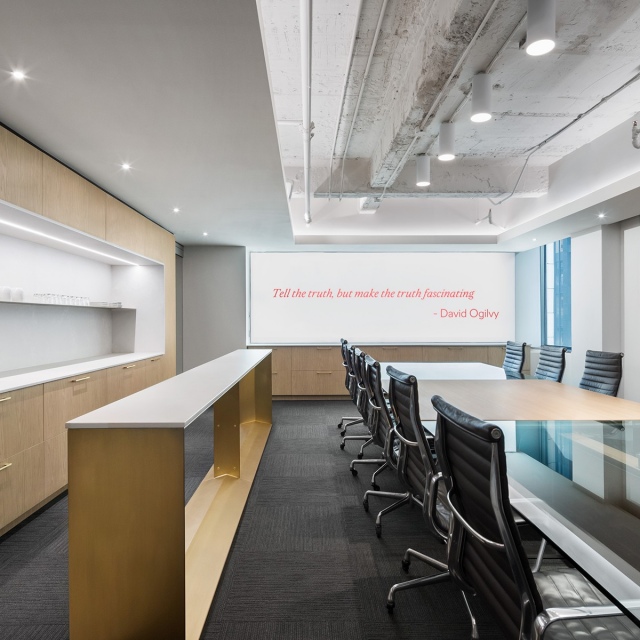
As we follow the red core, the space is divided into spaces for formal meetings, creative work and presentations with a capacity range from two to 20 people. Turning the corner into a hallway, we see a portrait of David Ogilvy and his quotations applied to glass surfaces, a source of inspiration and encouragement. With this third-floor new design that includes a 50% increase in floorspace, Ogilvy is now ready to host receptions and collaborative work, and celebrate all together their milestones.
The bottom line on this project is that it strikes a fine balance between opposites: a vibrant and intense space that is also comfortable, streamlined and intimate.
Photos: Stéphane Brügger
year
2019
area
8 200 sf
products and brands
- Phonebooth: Framery
- Furniture: Knoll, Herman Miller
- Lighting: Sistemalux, Arancia, Lambert et Fils
- Carpet: Mohawk
- Acoustic panels: Techni-Silence
- Quartz counter: Caesarstone

